
How to Create an Art-Directed Responsive SVG Hero Image
It's a well-known fact that websites that use images and graphics convert better. One of the pitfalls of using large images as hero images on a homepage is that the file size can be quite large, introducing a potential bottleneck in efficient page load. Another pitfall is that your competitors are probably also using an image as a hero image on their homepage. Why not buck the trend and use a graphic instead? You can get all the benefits of user engagement and visual interest while also keeping file sizes much smaller. The solution: a graphic in SVG (scalable vector graphic) format.
I recently implemented a SVG hero image on this very site, and here's how I did it.
Choose Your Vector Image Wisely
I ended up choosing a vector image from a stock image site as I wasn't feeling particularly crafty and knew I'd be able to customize whatever I chose as long as a source vector file (.eps or .ai file) was provided. I ended up changing up the colors in the image slightly and removing some of the vector elements in the scene to simplify it a bit. Since I didn't want the vector to distract too much from my tagline and call to action which would go on top of it, I also added a darkened gradient overlay, maintaining text readability.
Simplify and Optimize
With the extraneous graphic elements removed, I saved the file as SVG in Adobe Illustrator and was surprised how large the file size was (over 700KB). I was looking to improve page load, not worsen it! I dug around a bit in the various layers and discovered the culprit – a layer of blended shadows that was a compound path. The shadow effect was very nice but not worth a bloated file, so I decided to delete a bunch of the layers that were part of the blend and lower the opacity of the shadow so that the overall appearance still looked smooth.
I saved the modified graphic as SVG using the recommended Illustrator CS6 settings for minimizing file size (yep, I'm not on Adobe Creative Cloud quite yet!). The result was a SVG file size in the 200KB range – still not tiny but much more acceptable given the level of detail in the graphic. If I'd gotten rid of the shadow completely, the file size would have been under 30KB, but I was willing to make the tradeoff in this case since it was a prominent graphic on my site. Another thing to keep in mind is that as long as gzip is enabled on your web server, your effective SVG file size will likely be cut in half.
I next ran the SVG file through SVGOMG, Jake Archibald's awesome online SVG optimizer tool. Another great option is Peter Collingridge's online SVG editor.
Make Sure the SVG Fills its Container
Next it was time to get to the code. I initially added the SVG as an image file using a regular img tag.
I wanted to make sure the SVG took up the entire width and height of its container (a wrapper div), so I used Amelia Bellamy-Royds's padding-bottom approach on the container. As detailed in the article, I set the padding-bottom on the container to match the SVG's viewBox settings (viewBox height divided by viewBox width) in my CSS file, along with setting position: relative on the container div and position: absolute on the SVG itself.
Test On Your Site
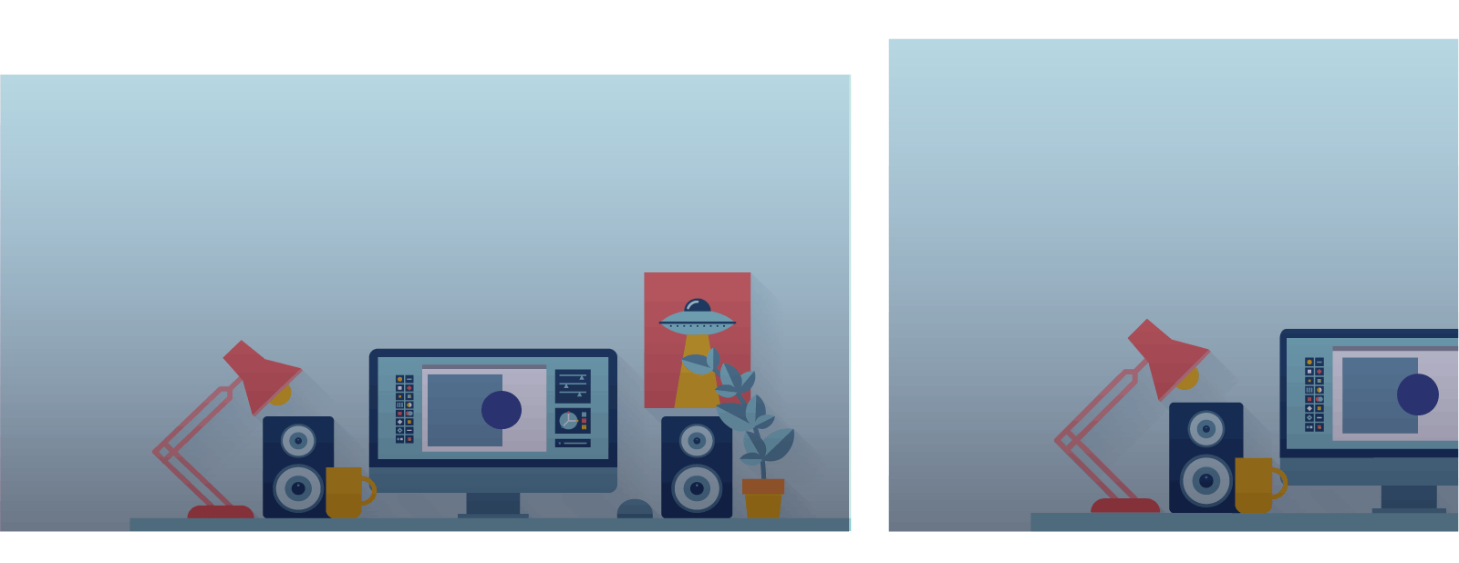
On my local staging server (I'm running this on WordPress using the Genesis Framework but the same steps would apply on any platform), I was able to easily test on multiple devices (older Android phone, iPhone 6, and an iPad, along with my laptop and desktop) since I use and love BrowserSync. I noticed that the graphic looked too small and distracted from the tagline on mobile screen sizes, so I decided to create a different SVG for mobile devices.

Create SVG Variations
This is where the art direction began. What is art direction? It's a term often used in responsive web design, when the designer creates a different version of an image or graphic for different screen sizes. Sara Soueidan's articles on art directing SVGs and art direction of SVGs using the picture element were excellent resources.
I created a cropped version of the SVG for mobile, with the office scene moved over a bit, allowing more room for my tagline. The cropped version also cut down on the file size a bit, bringing it to just over 100kB as I was able to delete more layers for elements not shown on the artboard in Illustrator.
I then used the picture element to allow for the browser to choose the appropriate SVG depending on screen size, as detailed in Sara Soueidan's article. I also created a fallback png version and made sure that Picturefill was included as a JavaScript dependency for the page for better browser support. Mine ended up looking like this:
    <picture>
      <source
        media="(max-width: 750px)"
          srcset="<?php echo get_stylesheet_directory_uri() . '/assets/svg/workspace-hero-small.svg'?>"
          type="image/svg+xml">
      <source
        srcset="<?php echo get_stylesheet_directory_uri() . '/assets/svg/workspace-hero.svg'?>"
        type="image/svg+xml">
      <img src="<?php echo get_stylesheet_directory_uri() . '/assets/images/workspace-hero.png'?>" alt="Sheelah Brennan - web design and development">
    </picture>
After further testing across my devices, I then decided to create a third variation of the graphic for mobile devices in landscape mode (which is another option you can specify in CSS media queries). This was necessary because the smaller graphic didn't look right when used as a parallax element that the user scrolls past. I used the smaller SVG file and just edited the width, viewBox, and preserveAspectRatio settings. I set the width to “auto” and then set preserveAspectRatio="xMinYMin meet". That made sure the aspect ratio was kept and that the viewBox resized to fit within the viewport (so the office scene was on screen and sized appropriately). There are truly endless variations to what you can do with SVG settings. Jakob Jenkov's article on SVG viewBox and viewport is worth checking out.
The final markup was:
    <picture>
      <source
        media="(min-width: 450px) and (max-width: 749px) and (orientation: landscape)"
          srcset="<?php echo get_stylesheet_directory_uri() . '/assets/svg/workspace-hero-landscape.svg'?>"
          type="image/svg+xml">
      <source
        media="(max-width: 750px)"
          srcset="<?php echo get_stylesheet_directory_uri() . '/assets/svg/workspace-hero-small.svg'?>"
          type="image/svg+xml">
      <source
        srcset="<?php echo get_stylesheet_directory_uri() . '/assets/svg/workspace-hero.svg'?>"
        type="image/svg+xml">
      <img src="<?php echo get_stylesheet_directory_uri() . '/assets/images/workspace-hero.png'?>" alt="Sheelah Brennan - web design and development">
    </picture>
Test Across Browsers and Devices
Finally, I did more testing using BrowserSync across different browsers and mobile devices that I had on hand. The three SVG options plus fallback png ended up being the solution that I went with. The nice thing about using the picture element is that I could easily add more SVG variations for different screen sizes later on. To see the end result, see this codepen.
Featured image by Free-Photos via Pixabay